ORIGINI HUB
2025
discipline: WEB DESIGN | UI/UX
Implementing: RESPONSIVE WEBSITE
Project Overview
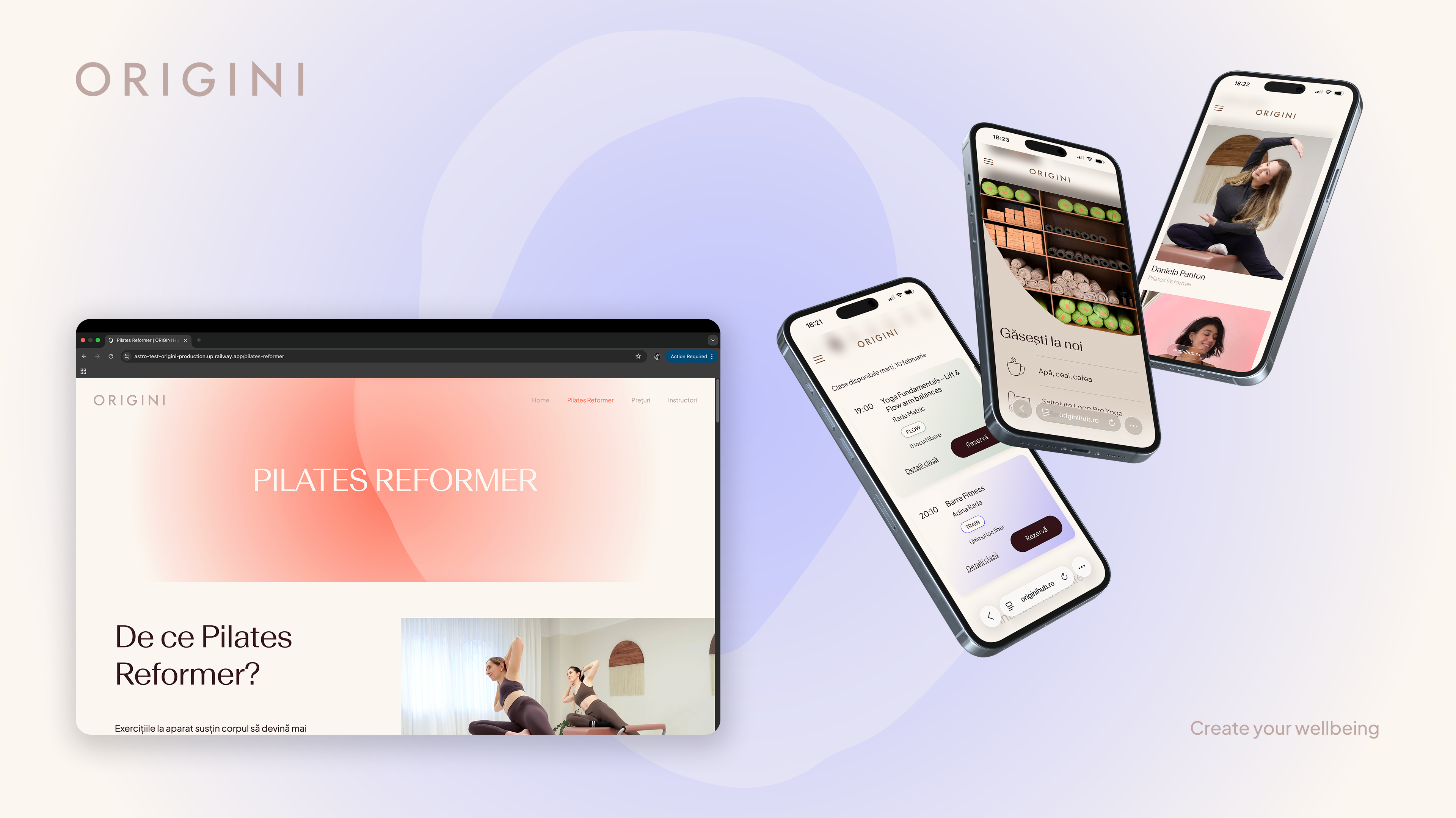
Website Redesign & Rebranding
Role: Web designer, UI designer, Graphic designer
Team: 1 PM & developer, 1 designer, 1 business owner
Skills: Product thinking, User Interface design, Visual design
Tools: Adobe XD, Figma, Adobe Illustrator & Photoshop
Team: 1 PM & developer, 1 designer, 1 business owner
Skills: Product thinking, User Interface design, Visual design
Tools: Adobe XD, Figma, Adobe Illustrator & Photoshop
The Business
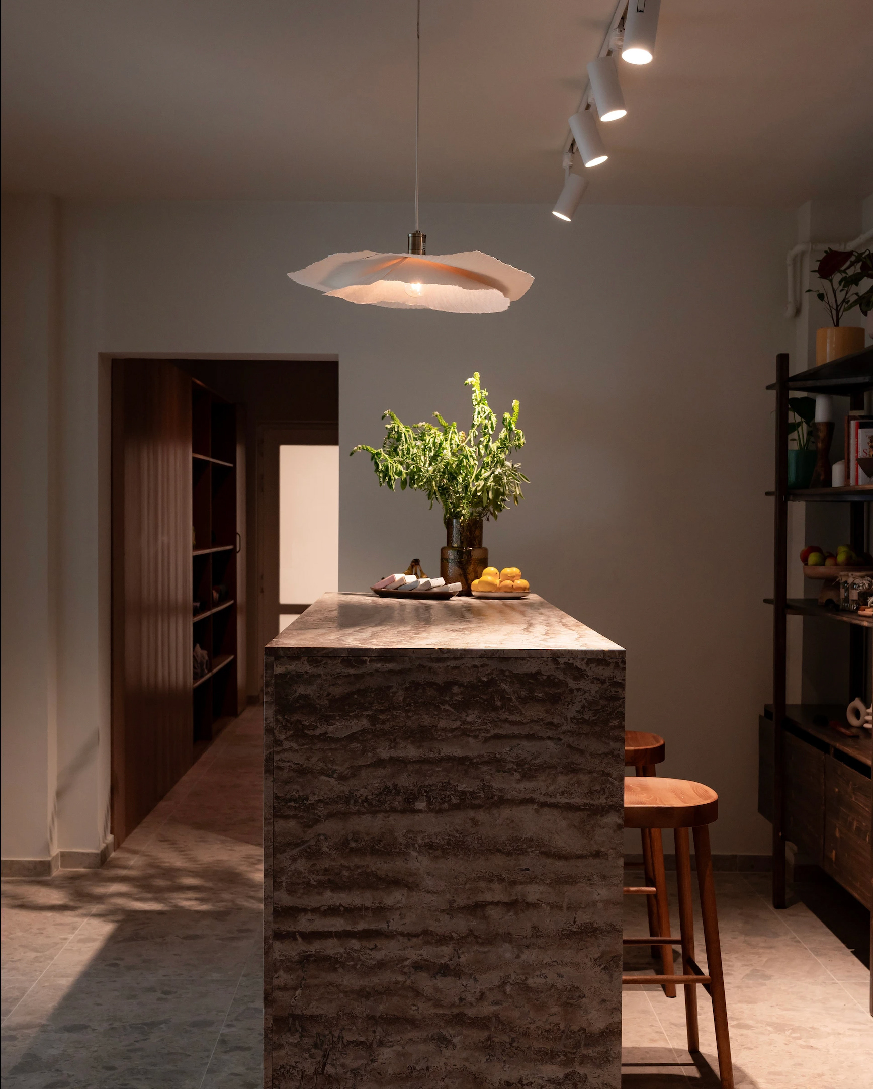
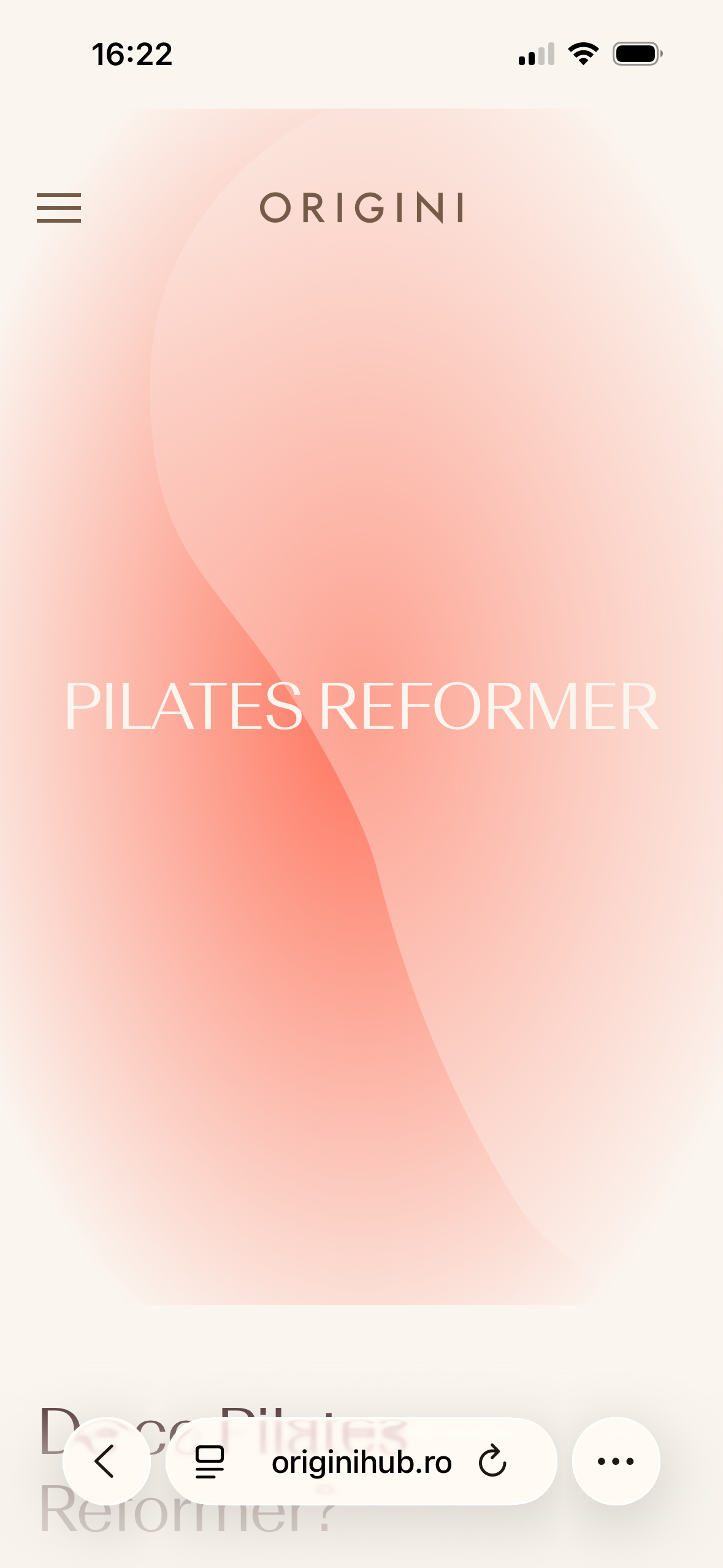
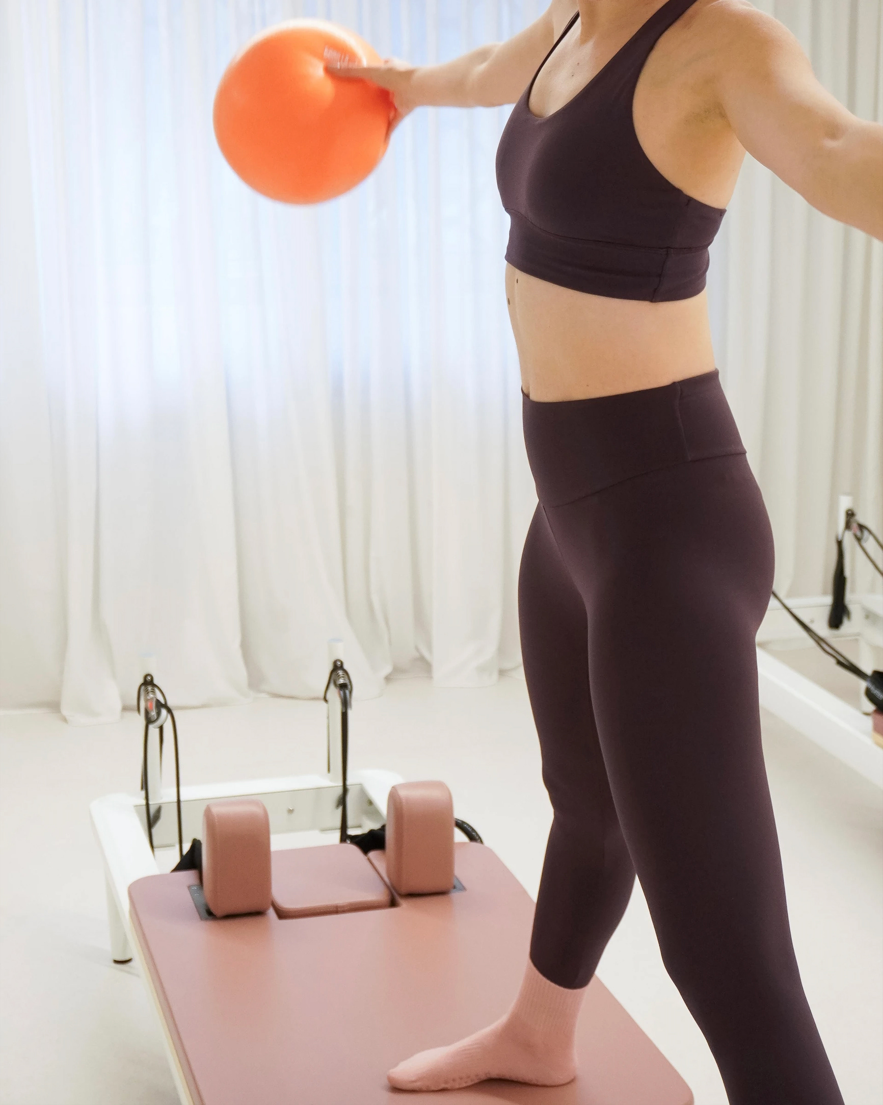
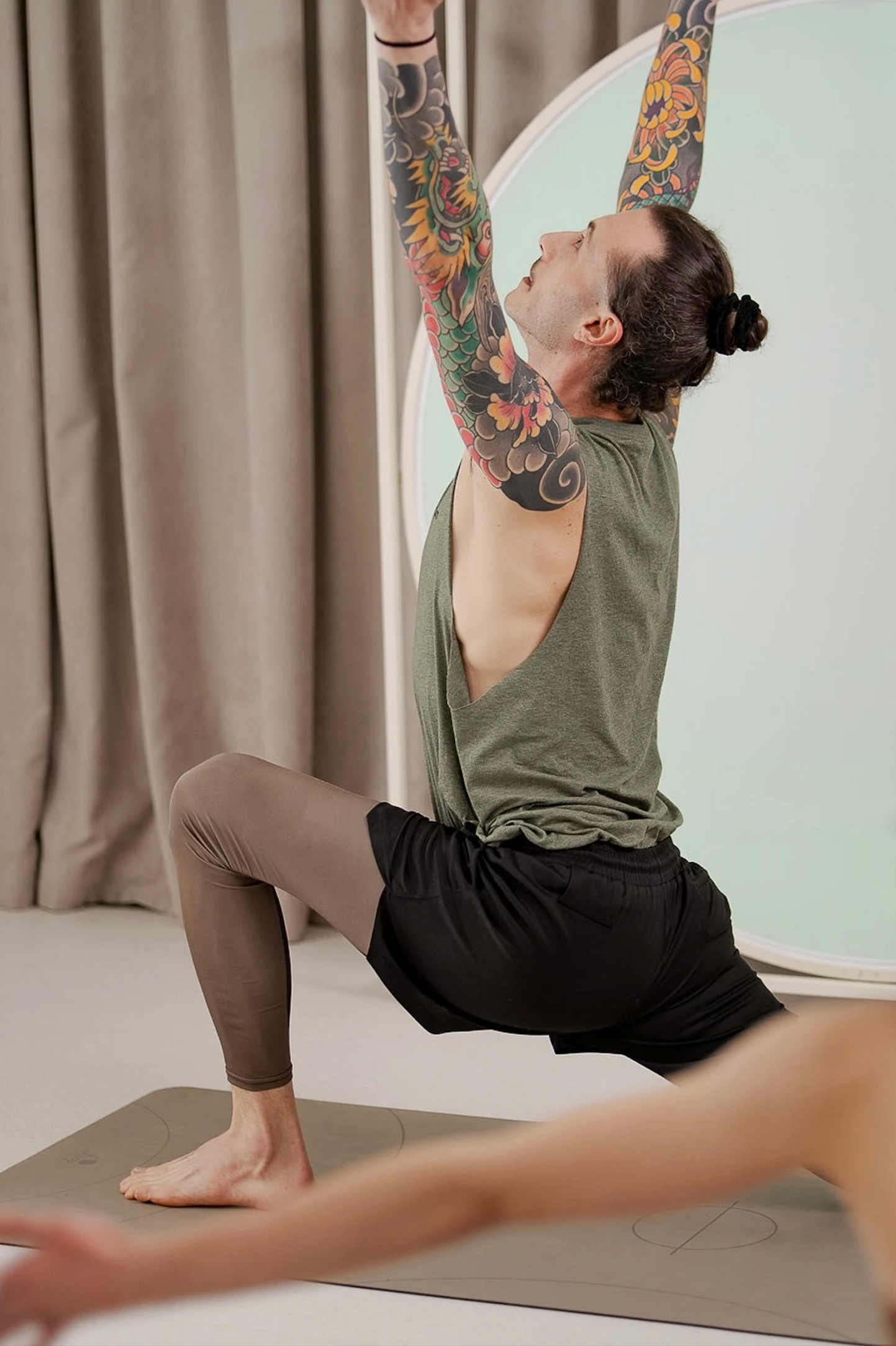
ORIGINI Hub is a yoga and Pilates studio located in Bucharest, Romania. The place stands out through its aesthetic interior design and calming ambience, creating a warm, welcoming environment for movement and relaxation. It offers a variety of mindful classes – from yoga to Pilates, mobility and posture training, guided meditation, and sound healing, with attentive instruction and a focus on presence and wellbeing. Periodically, the space also hosts creative workshops and wellness experiences, helping visitors reconnect with their body and breath in a serene setting.
The Context
The previous Origini website lacked structural clarity and visual consistency, resulting in a fragmented cross-device experience and friction during key conversion moments. Users struggled to scan offerings, compare classes, complete bookings confidently, and access practical information such as equipment needs or rescheduling policies – ultimately weakening trust and slowing decision-making.
The Goal
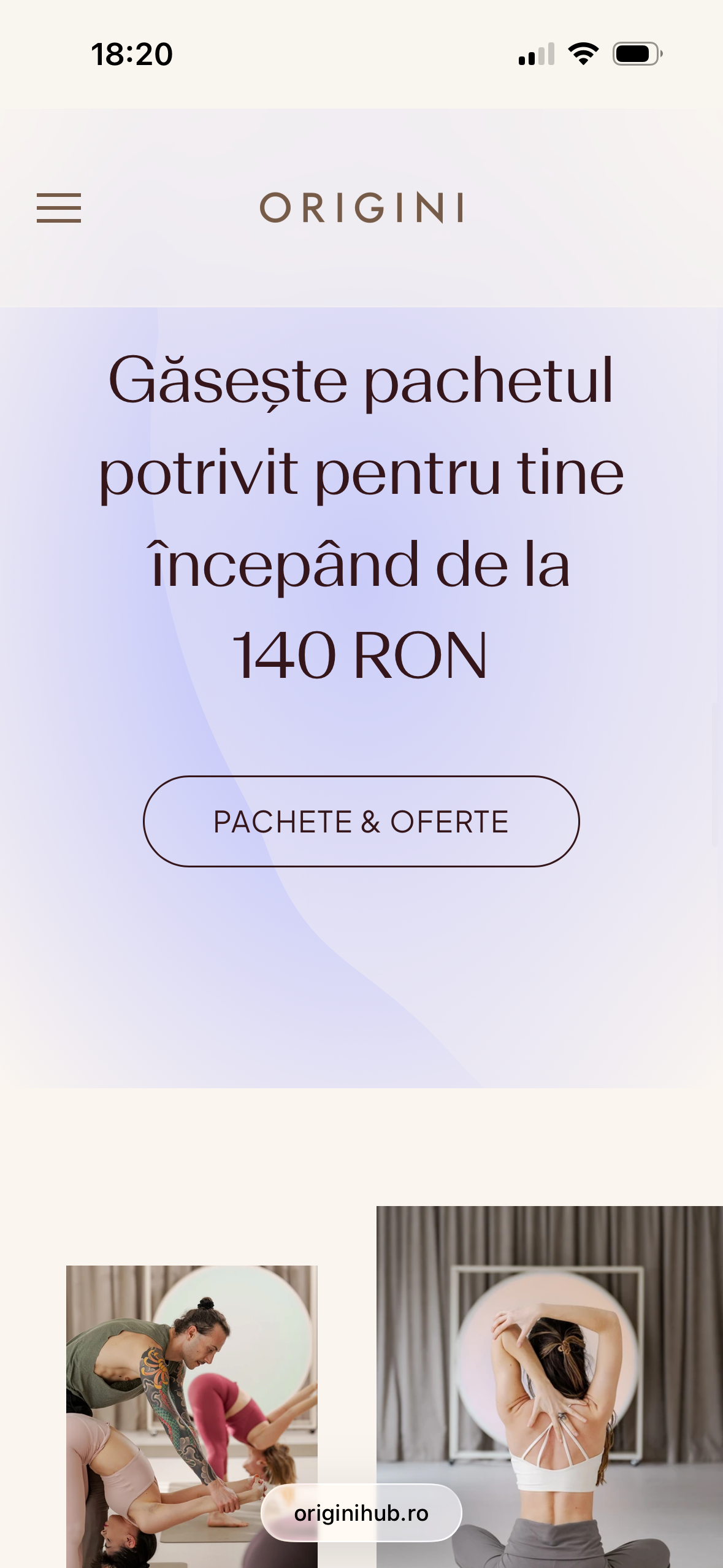
Design a responsive website experience that helps users:
• Quickly scan available activities
• Stay informed about pricing, classes, and trainers with ease
• Choose and purchase the right classes fast
• Stay motivated with clear yet flexible schedules
• Quickly scan available activities
• Stay informed about pricing, classes, and trainers with ease
• Choose and purchase the right classes fast
• Stay motivated with clear yet flexible schedules
The Result
• Defining business and user goals
• Refining the visual identity
• Defining a cohesive visual communication through multiple touchpoints
• Focus on expressive UI
• Design scalable and modular components
• Reliable responsive website
• Merch assets
• Refining the visual identity
• Defining a cohesive visual communication through multiple touchpoints
• Focus on expressive UI
• Design scalable and modular components
• Reliable responsive website
• Merch assets
Post-Launch Performance Metrics
Following the redesign and launch, user engagement showed significant improvement:
• +37% increase in average session duration
(from 2:45 min to 3:46 min), indicating stronger user interest and improved content discoverability.
• +204% increase in average interactions per session, demonstrating a substantial boost in user engagement and interface usability.
• +63% increase in page views per session, suggesting more effective navigation and clearer information architecture.
• +204% increase in average interactions per session, demonstrating a substantial boost in user engagement and interface usability.
• +63% increase in page views per session, suggesting more effective navigation and clearer information architecture.
Together, these metrics validate the redesign’s impact on usability, engagement, and overall user experience.
Research Insights
Methods Used
• Product audit
• Competitor analysis (Hotpod Yoga, Souk Yoga Studio)
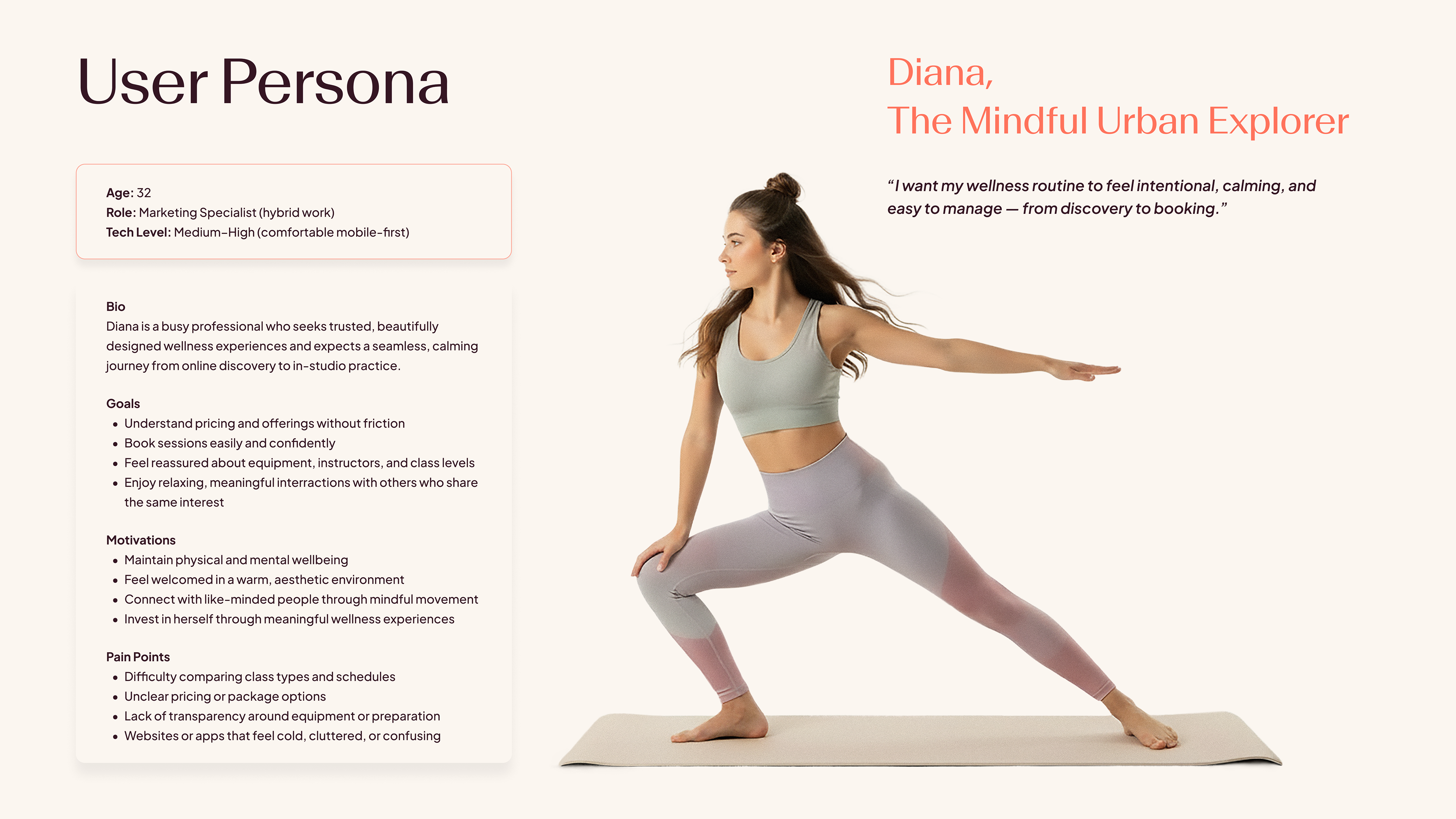
• Persona creation
• Direct approach – personally booking & attending classes, and observing visitiors' interractions and habbits insite
• Competitor analysis (Hotpod Yoga, Souk Yoga Studio)
• Persona creation
• Direct approach – personally booking & attending classes, and observing visitiors' interractions and habbits insite
What I Found
Users want to:
• Experience a premium physical–digital journey
• Feel safe and confident using the platform
• See a clear connection between the studio’s aesthetics and the digital product
• Build sustainable movement habits
• Connect with others and feel part of a community
• Experience a premium physical–digital journey
• Feel safe and confident using the platform
• See a clear connection between the studio’s aesthetics and the digital product
• Build sustainable movement habits
• Connect with others and feel part of a community
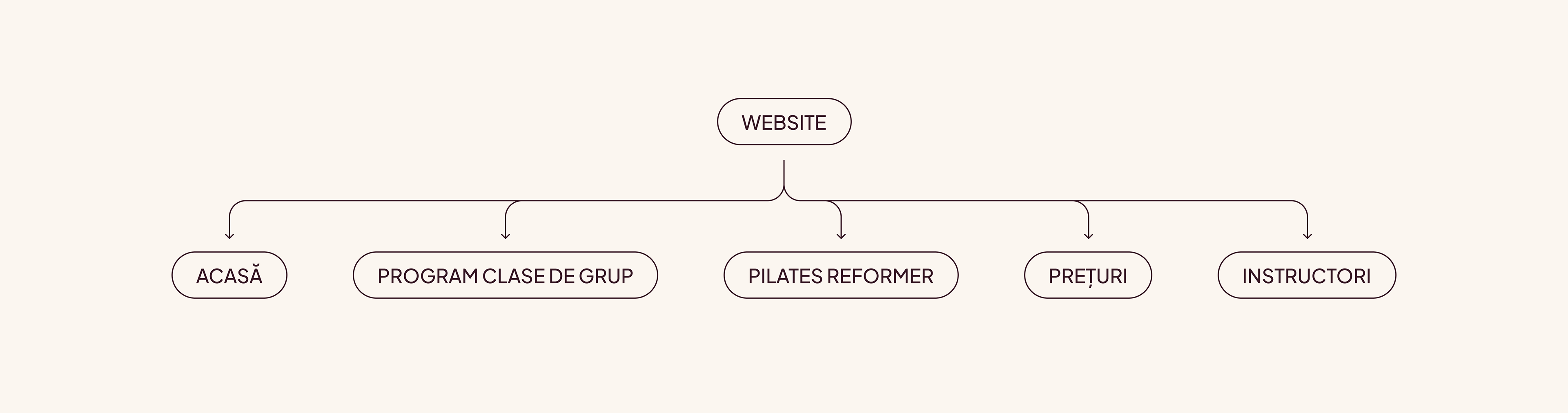
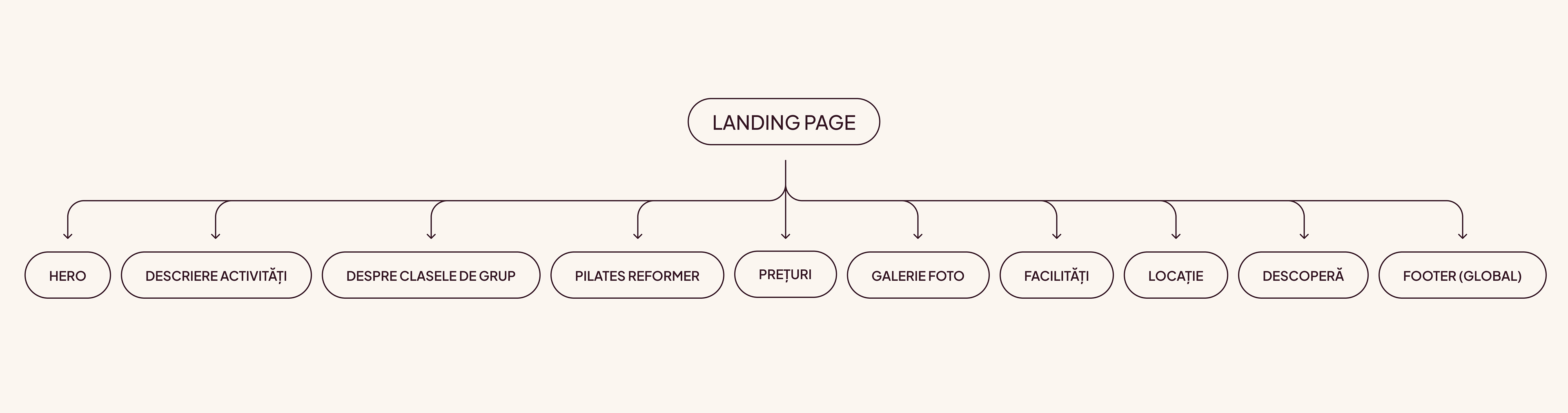
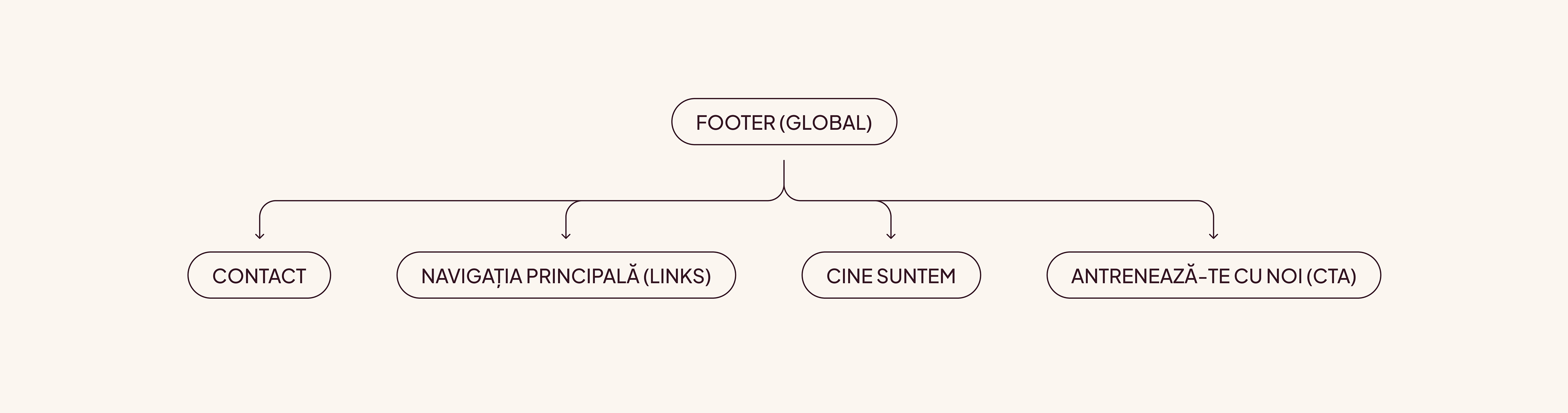
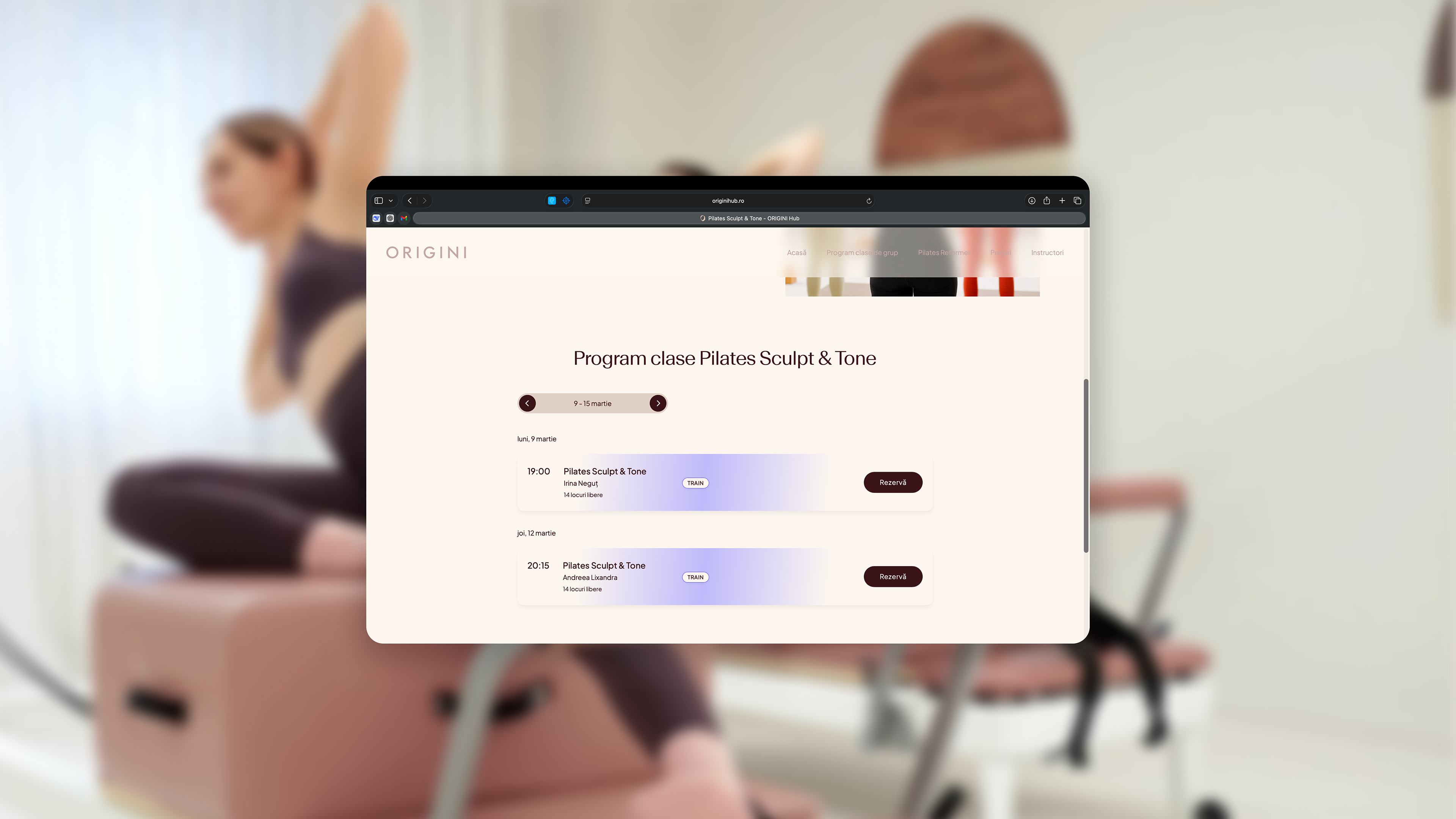
Information Architecture
The information architecture was defined by the project manager and developer, and designed it around multiple user entry points. Marketing traffic is directed to a standalone landing page, while returning users primarily navigate through the main website.
This approach supports distinct intent paths:
• Website: exploration and information retrieval
• Landing page: conversion-focused narrative
• Website: exploration and information retrieval
• Landing page: conversion-focused narrative
To preserve clarity and avoid disrupting established navigation patterns, the landing page was intentionally kept separate from the global site hierarchy.
1. Sitemap
2. Landingpage (Standalone) | Sections
3. Footer (Global) | Second Navigation Bar
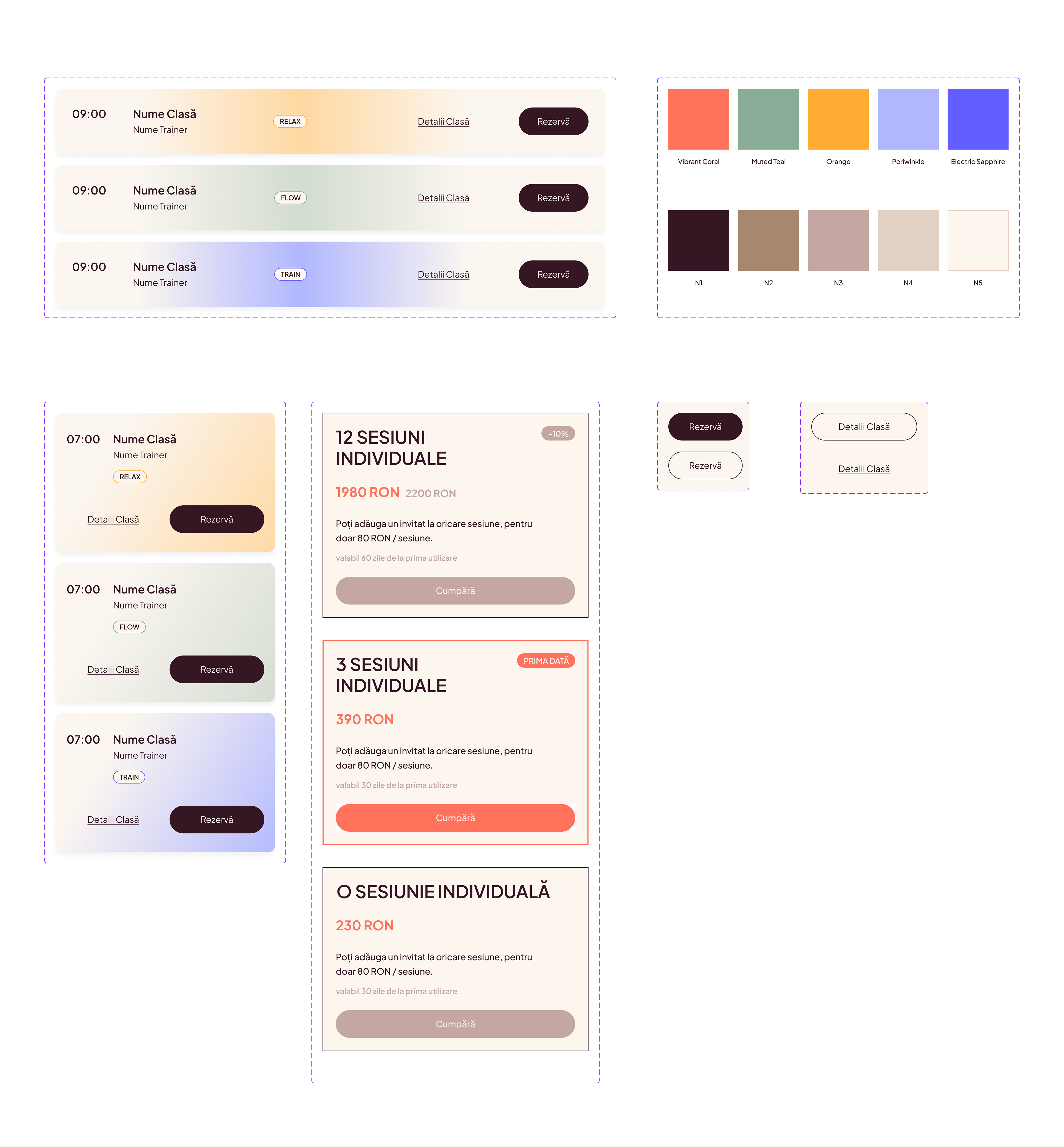
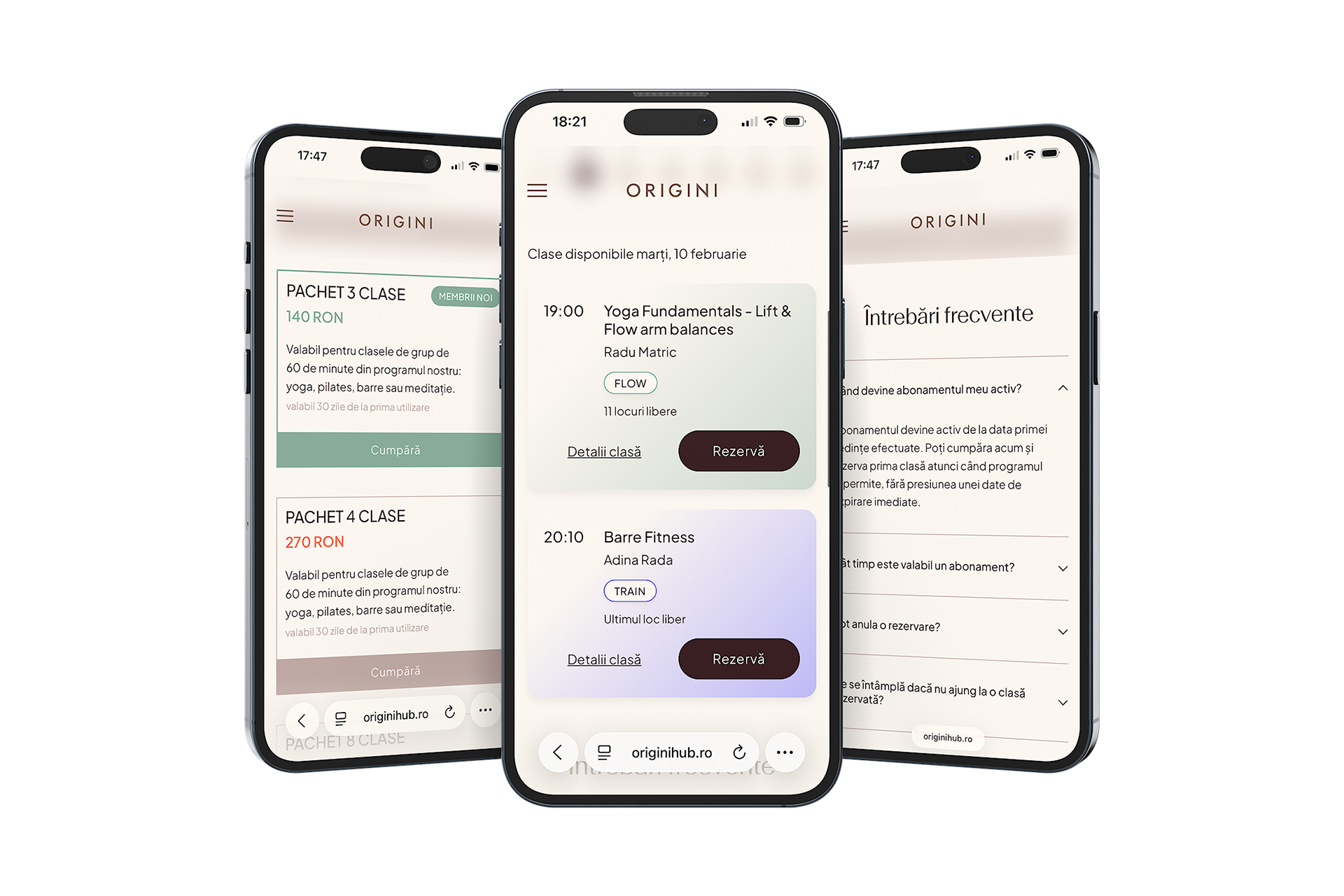
Modular UI Components
In close collaboration with the developer, we designed a modular component system to support scalability and consistency across the product. This approach enabled flexible content layouts, faster iteration, and reliable responsiveness – while maintaining a cohesive visual language across all touchpoints.
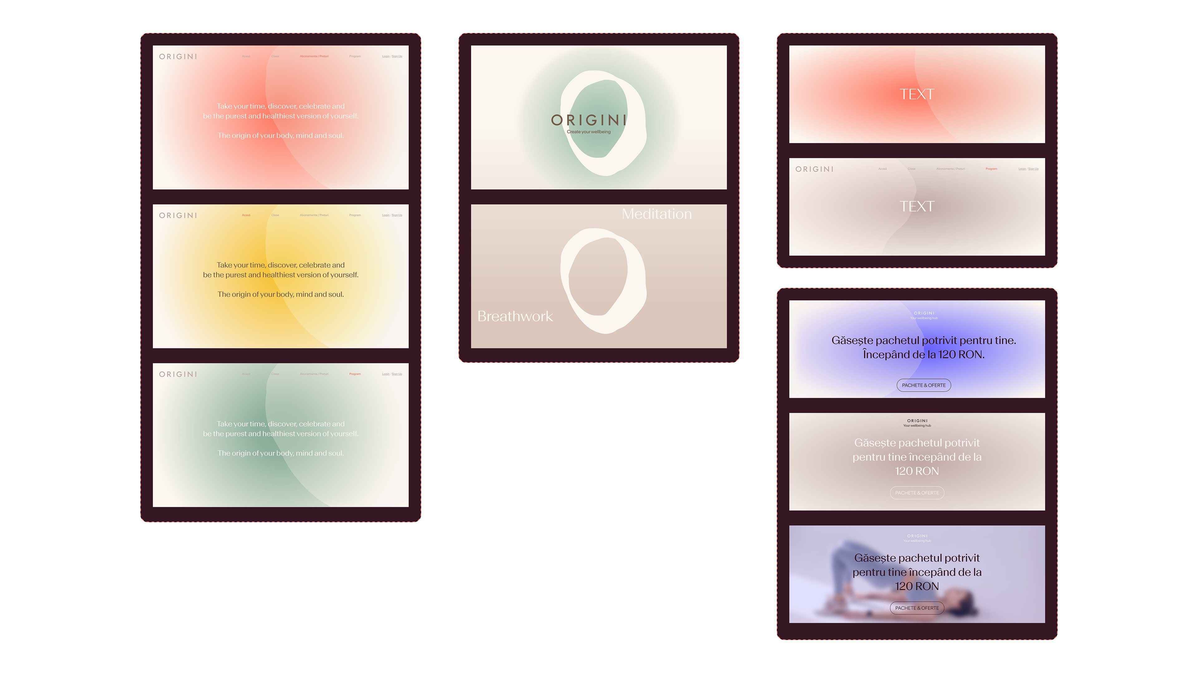
Visual Identity Strategy
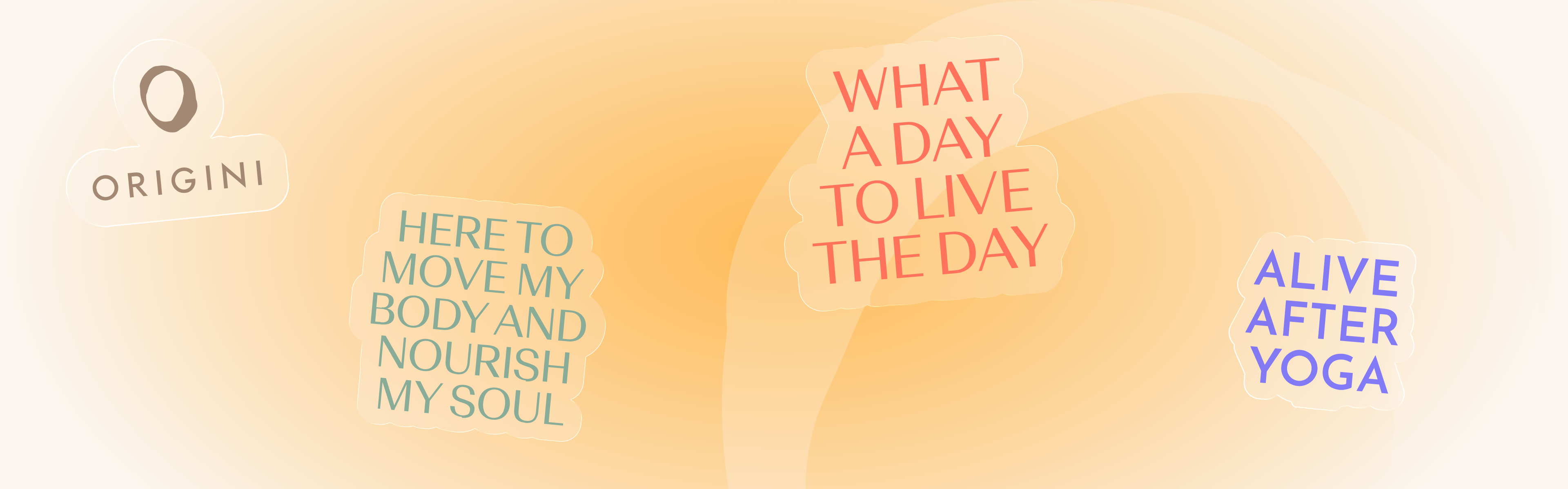
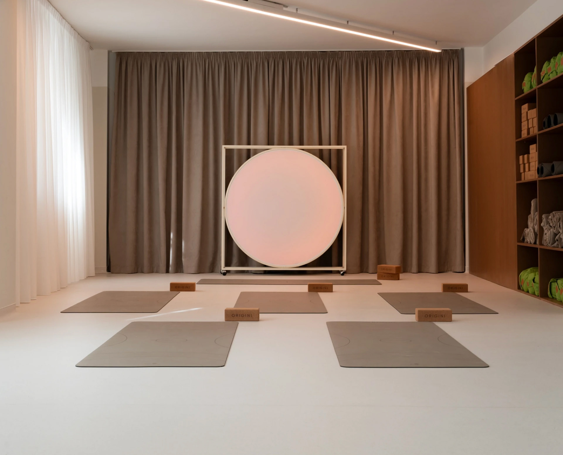
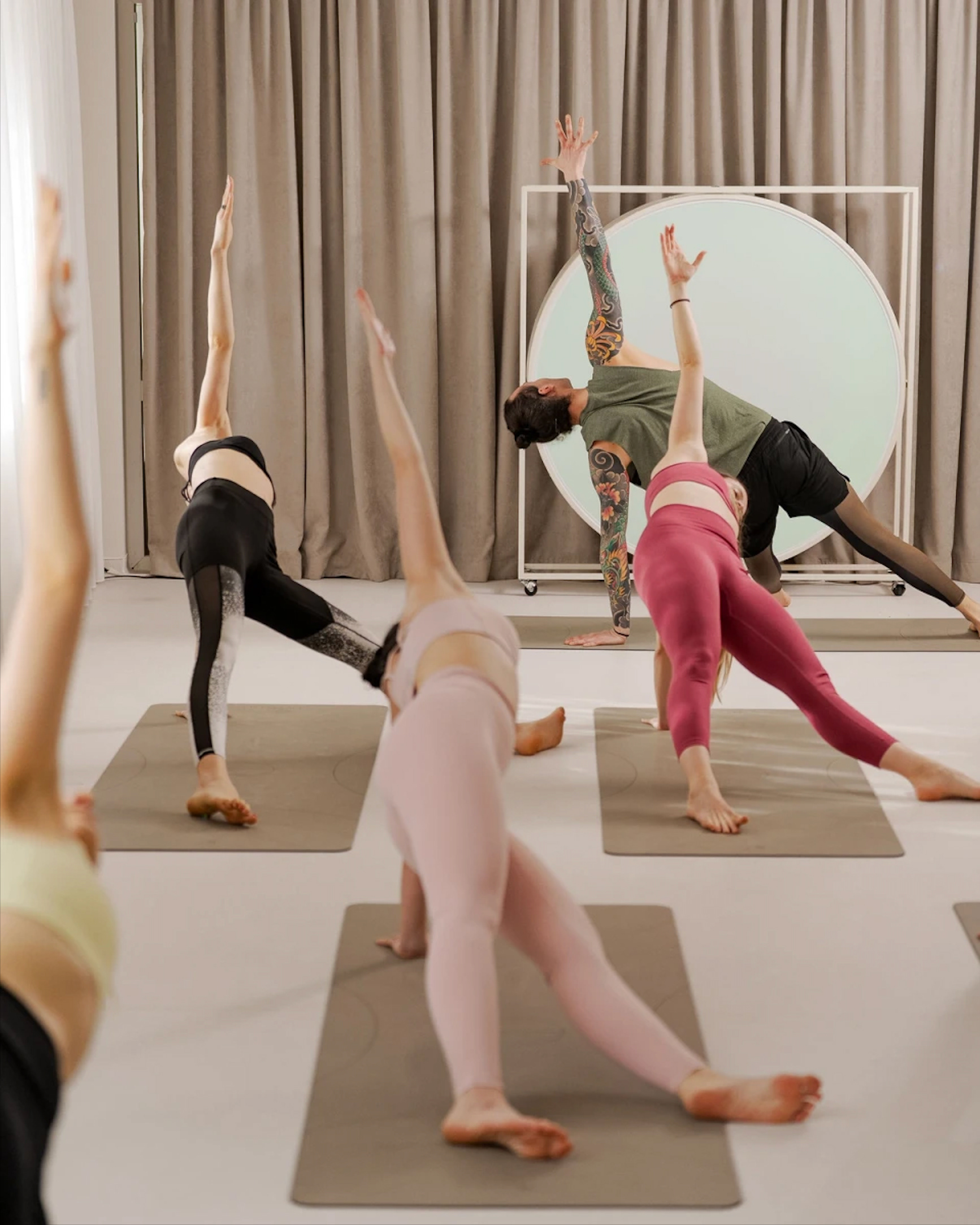
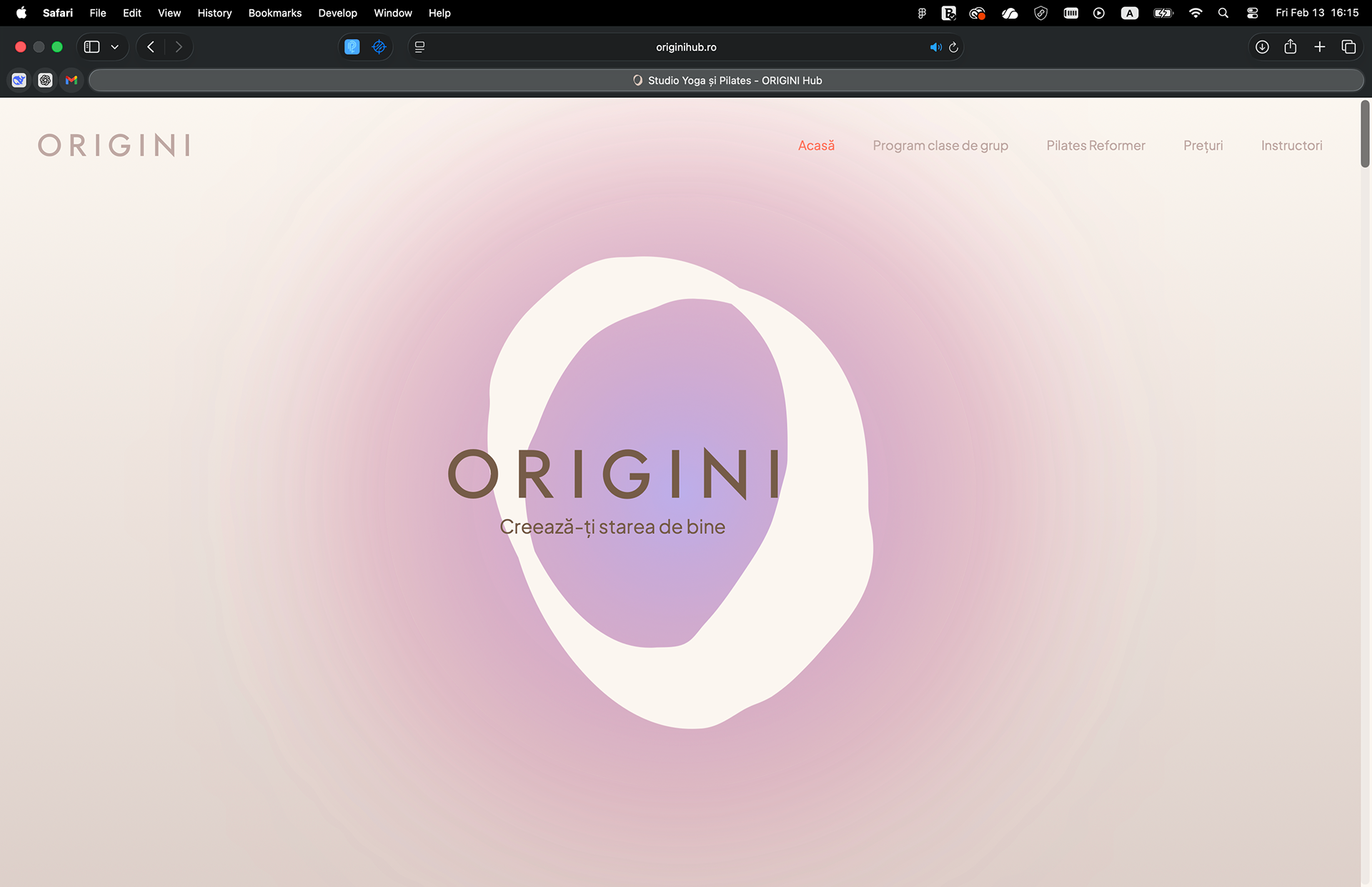
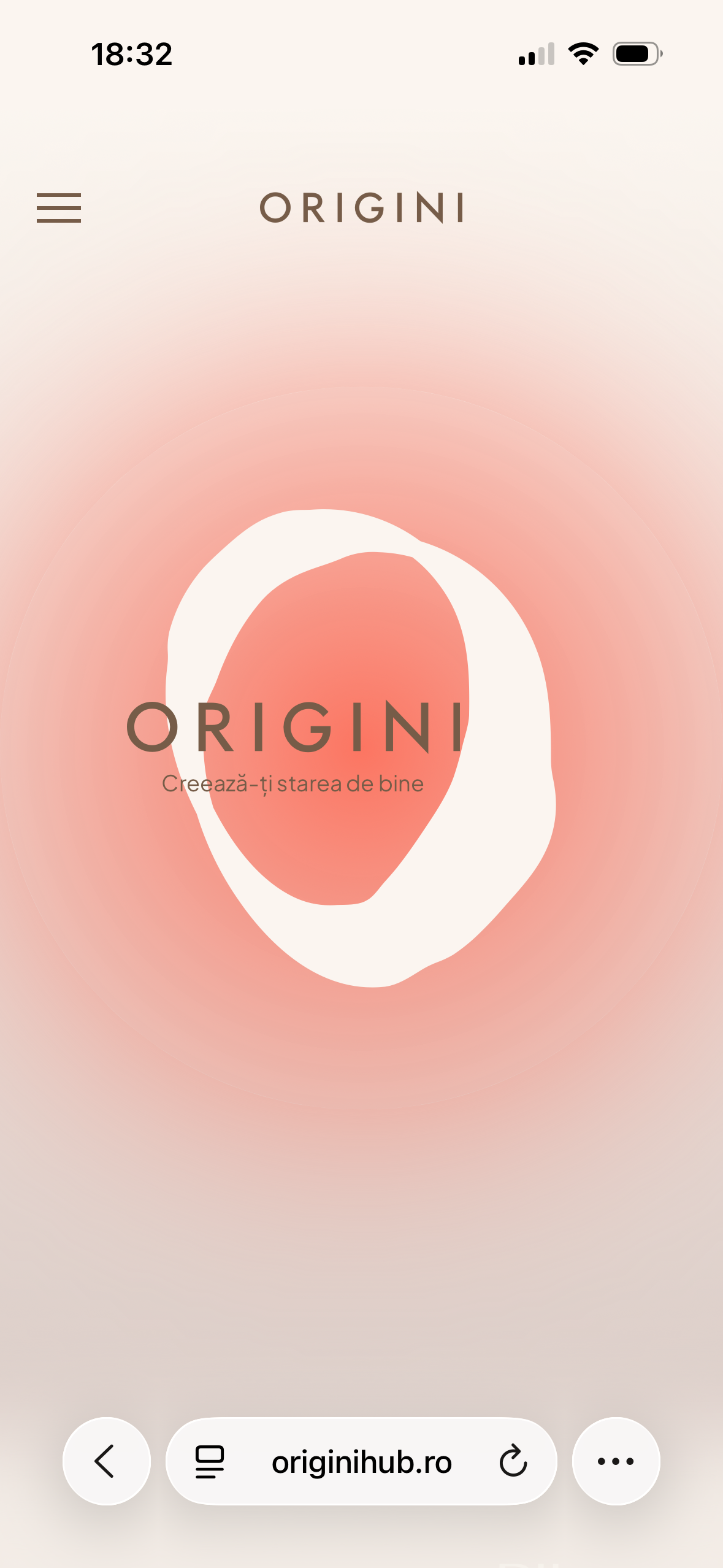
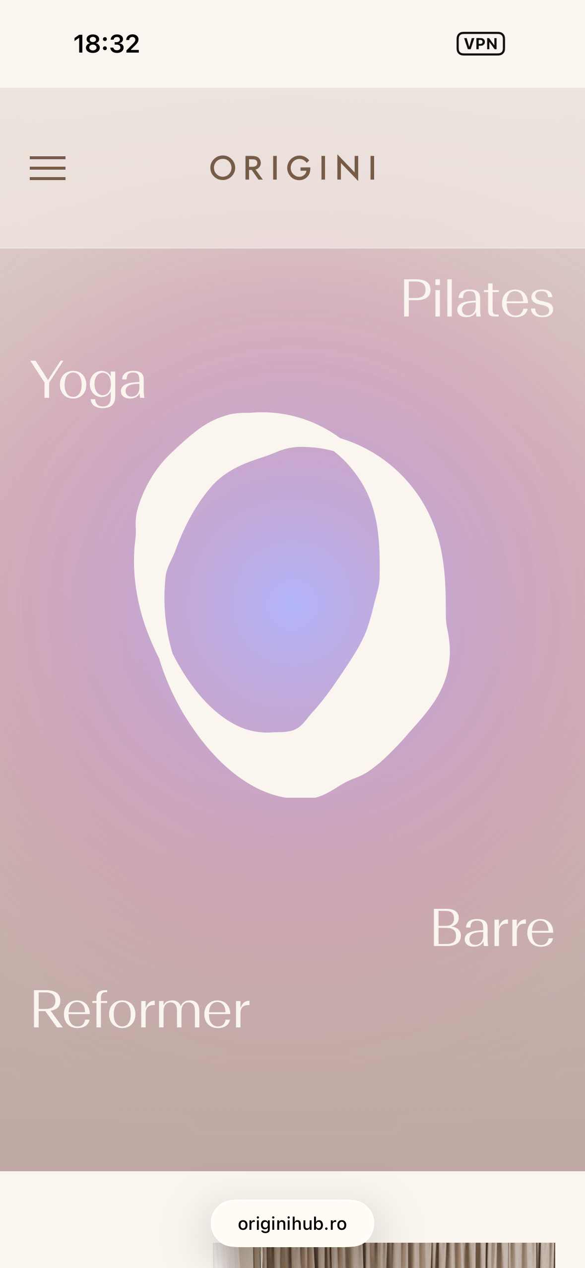
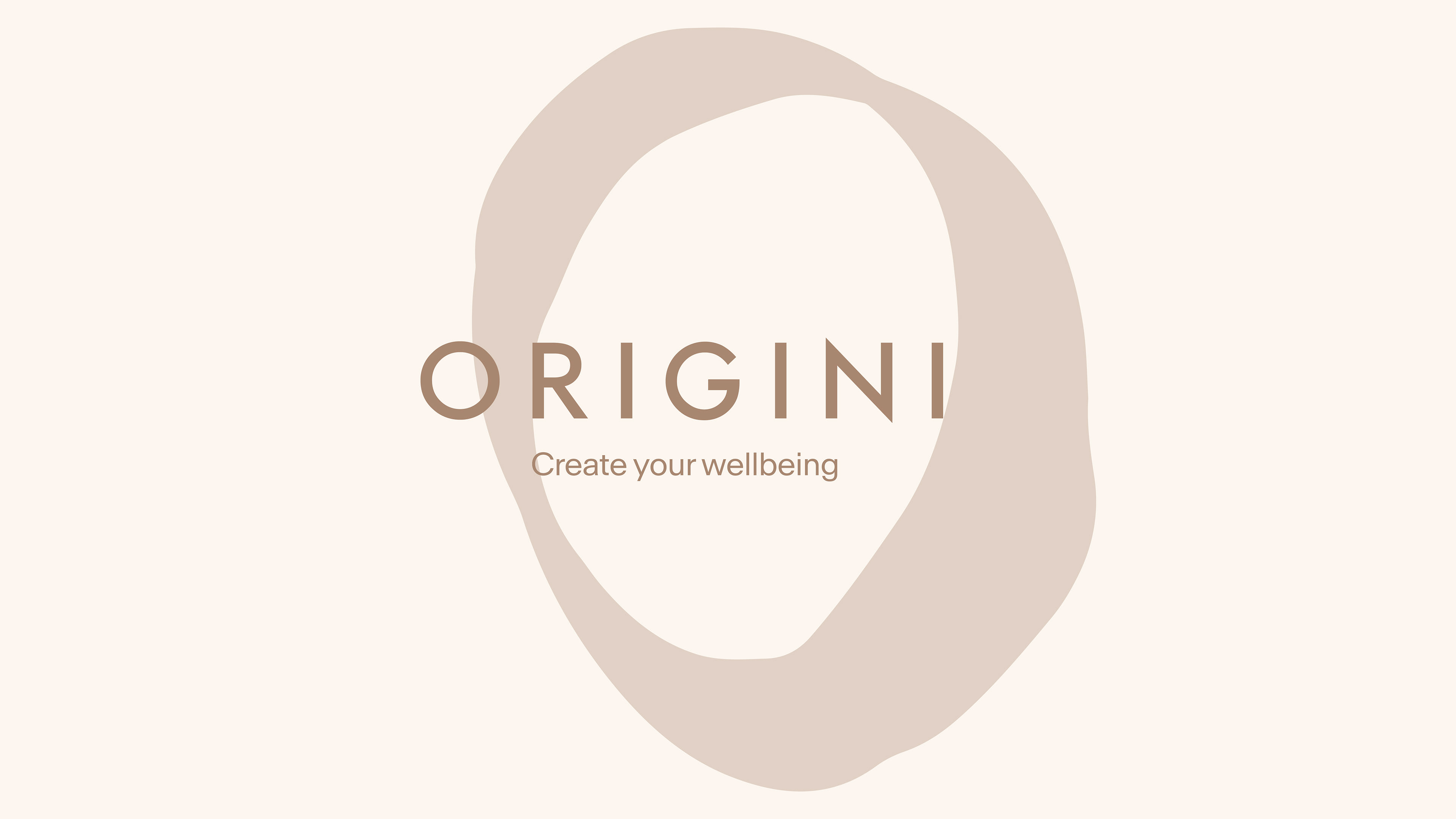
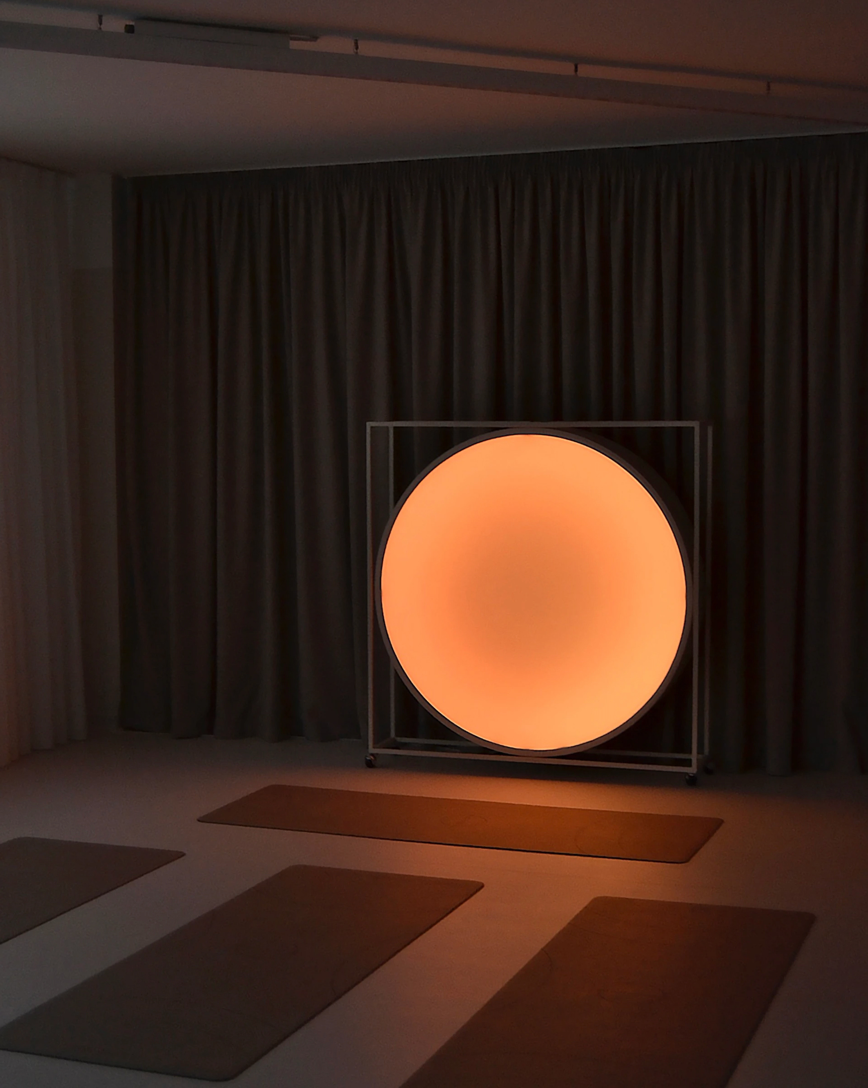
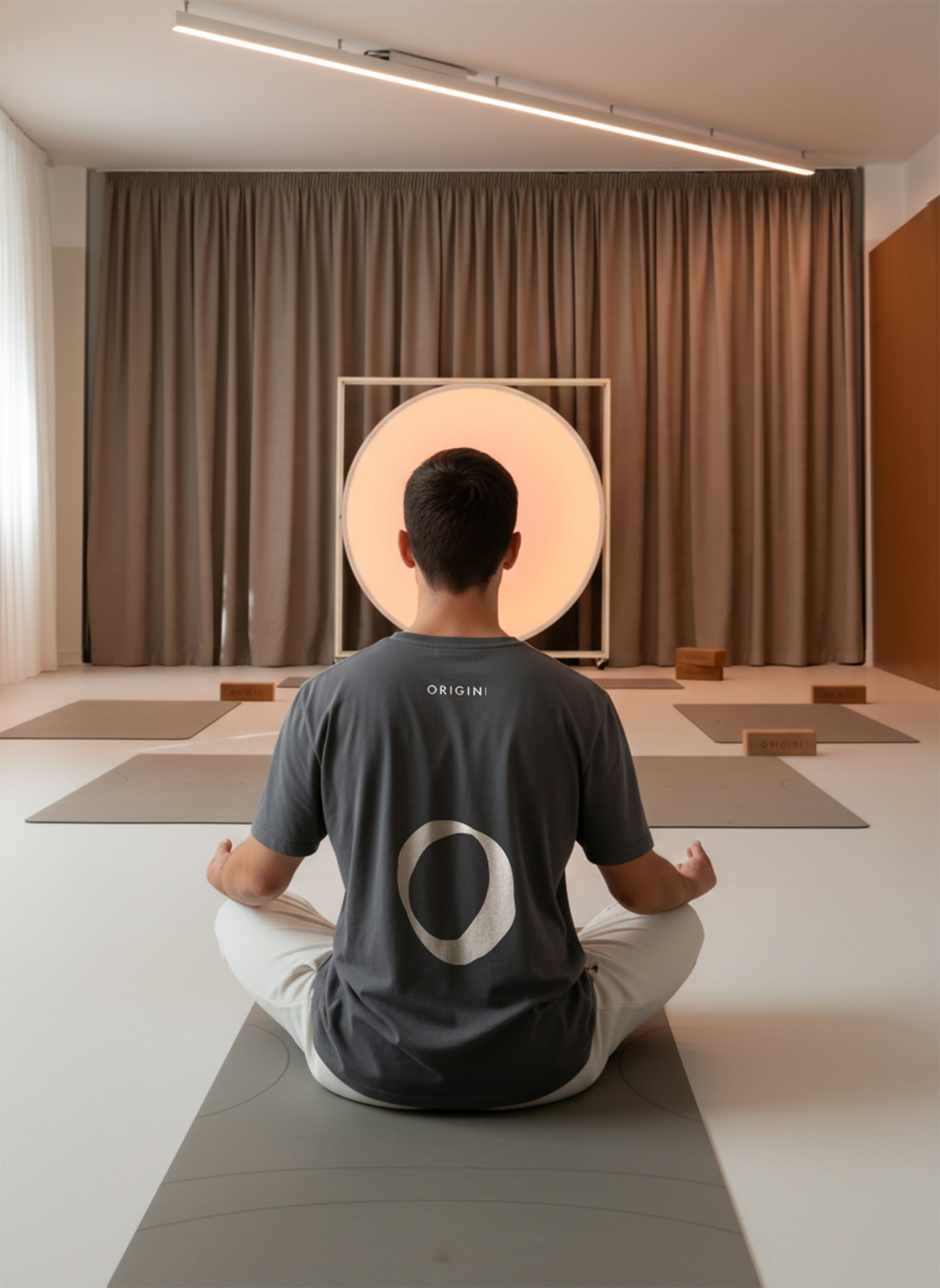
The UI direction was shaped by the studio’s most recognizable physical element: the circular lightbox in the main room at ORIGINI Hub. As a symbol of harmony, safety, and presence, the circle became the conceptual anchor of the visual system. Beyond its spatial role, this element is highly shareable – frequently photographed by visitors – supporting organic brand visibility across social platforms.
This concept aligns naturally with the existing logo symbol: a raw, imperfect “O” (from Origini / Origins), representing a personal journey inward –returning gently to one’s roots. Since the logo was already familiar to returning users, it was intentionally preserved and refined rather than redesigned.
What Was Retained
• Core logo components (enhanced by integrating the studio motto directly into the symbol).
• Neutral base colors from the original brand guidelines.
• Neutral base colors from the original brand guidelines.
What Was Refined
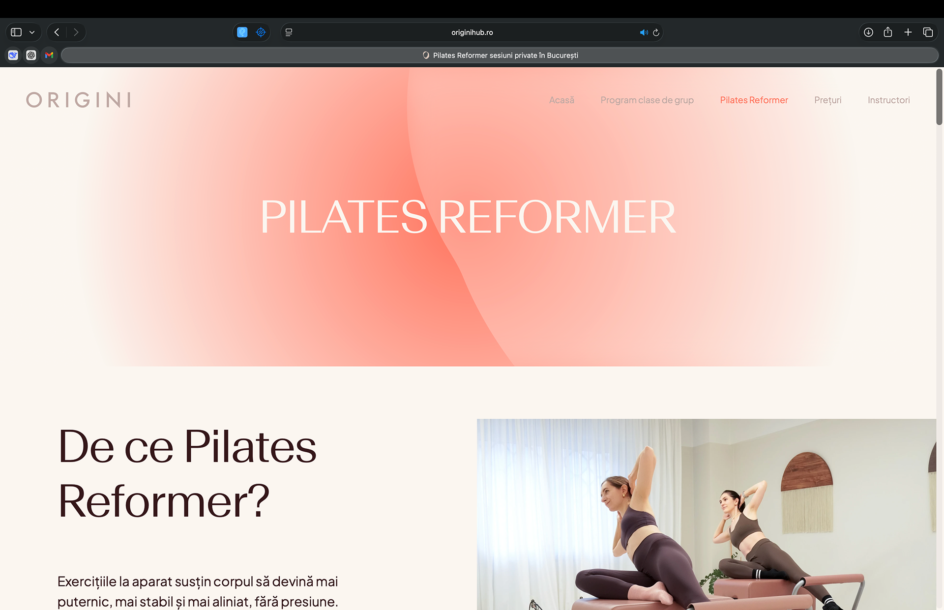
Typography
• Display font: premium, fluid, airy, minimalist – used to express calm and openness.
• Body font: geometric sans-serif with a slightly taller x-height, improving readability and spacing for digital interfaces.
• Display font: premium, fluid, airy, minimalist – used to express calm and openness.
• Body font: geometric sans-serif with a slightly taller x-height, improving readability and spacing for digital interfaces.
Color palette
• A soft mix of neutrals (earth tones) and subtle pastels, avoiding high-contrast or flashy tones to reinforce a calm, premium atmosphere.
• A soft mix of neutrals (earth tones) and subtle pastels, avoiding high-contrast or flashy tones to reinforce a calm, premium atmosphere.
UI expression
• Glassmorphism layers and gentle gradients were introduced to create depth and elegance, supporting a modern yet serene feel.
• Glassmorphism layers and gentle gradients were introduced to create depth and elegance, supporting a modern yet serene feel.
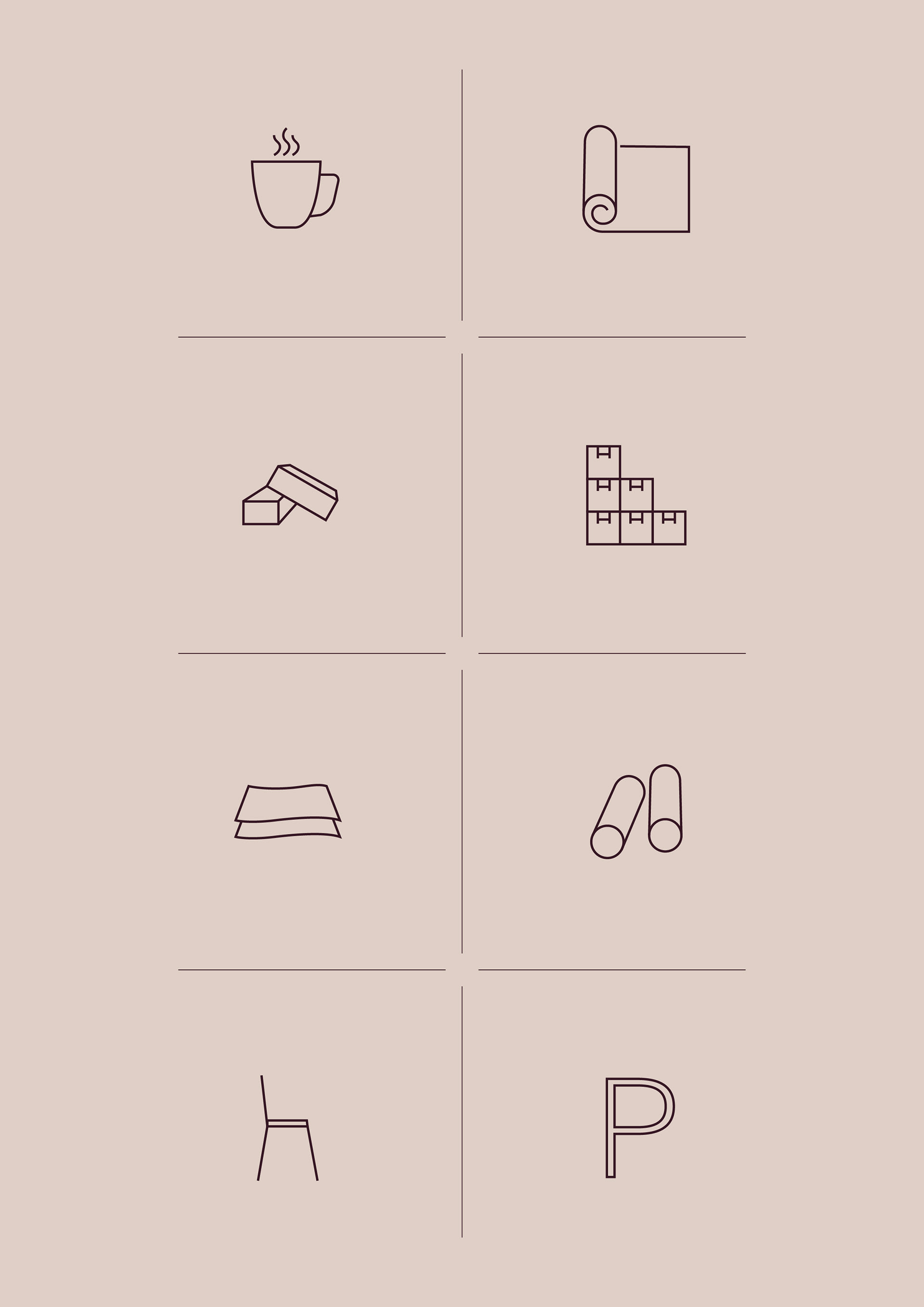
Custom iconography
• Purpose-built icons were designed to clearly communicate studio facilities and services, improving scannability while maintaining visual cohesion.
• Purpose-built icons were designed to clearly communicate studio facilities and services, improving scannability while maintaining visual cohesion.
Reflections & Learning
What Worked Well
• Strong physical – digital alignment
• Clear separation of user intent paths
• Modular system approach
• Expressive yet restrained visual language
• Cross-functional collaboration
• Clear separation of user intent paths
• Modular system approach
• Expressive yet restrained visual language
• Cross-functional collaboration
Opportunities for Future Improvements
• Deeper user validation
• Personalization opportunities
• Expanded content strategy
• Iterative design system evolution.
• Personalization opportunities
• Expanded content strategy
• Iterative design system evolution.